 Oklahoma
If you showed me this quarter and asked me which state it represented, I would run through most of the Southeast, Northeast, Midwest, and Pacific Northwest before I would guess Oklahoma. The scissor-tailed flycatcher may be a unique bird and the Indian Blankets may be the official state flower, but nothing about the quarter itself shows me what Oklahoma itself looks like (aside from the fact that it evidently has lots of these birds and flowers running around). A state outline would go a long way here.
Rating: 5¢
 New Mexico
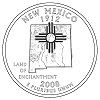
This quarter makes a decent effort to represent the state but it could do more. I like the state outline and the motto. The Zia sun symbol is ubiquitous in New Mexico and I couldn't imagine a quarter without it. While incorporating terrain into the state logo is an interesting gloss, I feel that it's used an excuse to avoid actually depicting a scene from state. I can tell where the mountains and rivers are, I just can't tell what they look like. Overall, it comes across a bit bland.
Rating: 10¢
 Arizona
If New Mexico's quarter is too bland, Arizona's is too frantic. I applaud the state's desire to highlight the dual icons of the Grand Canyon and the Saguaro cactus. I also applaud the state's commitment to accuracy in dividing the two icons with a sash in order to demonstrate that they're not found in the same part of the state. But this quarter goes too far in trying to be realistic. A coin that's just over an inch in diameter is just too plain small for a realistic depiction of intricate geologic and botanical formations.
Rating: 10¢
 Alaska
We'll start with what I don't like: I would have hoped to see mountains or glaciers on this quarter and I've never heard the nickname "The Great Land" used for Alaska. ("The Last Frontier," yes.) But this quarter does a nice job showing off Alaska's unadulterated wilderness with a primal scene of bear snatching a salmon out of a cascading river. The subtle inclusion of a single star is a brilliant way to recognize the iconic North Star highlighted on the Alaska state flag, especially since it is positioned in roughly the same place on the quarter and flag.
Rating: 20¢
 Hawaii
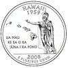
I'm a fan of the state outline, and while the foreign language phrase is voluminous, it is the official state motto, so I'll cut it some slack. King Kamehameha is certainly an important figure in Hawaii's history, plus his inclusion creates the novelty of royalty depicted on American currency. There does seem to be an excess of blank space on this quarter, but as an island state, Hawaii can't really help it. I guess the only major thing I would change would be finding some way to put a volcano on the coin.
Rating: 15¢
No comments:
Post a Comment